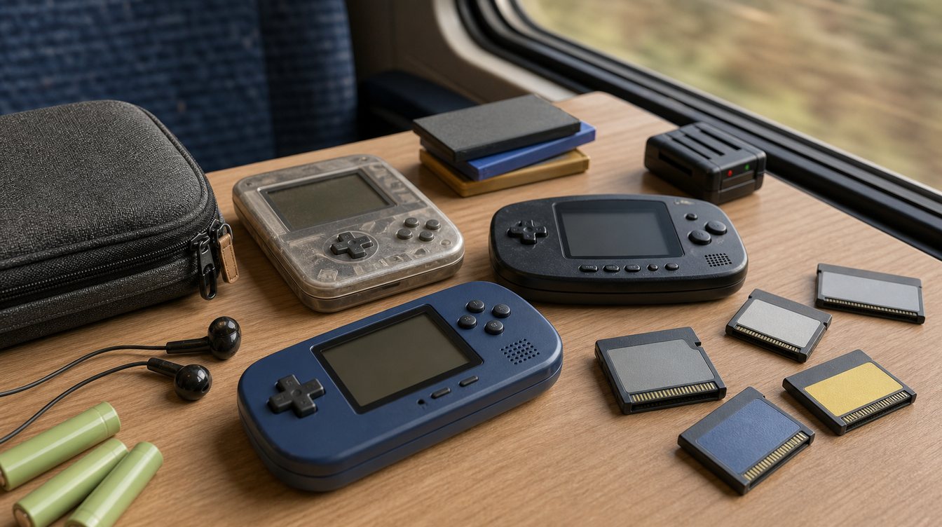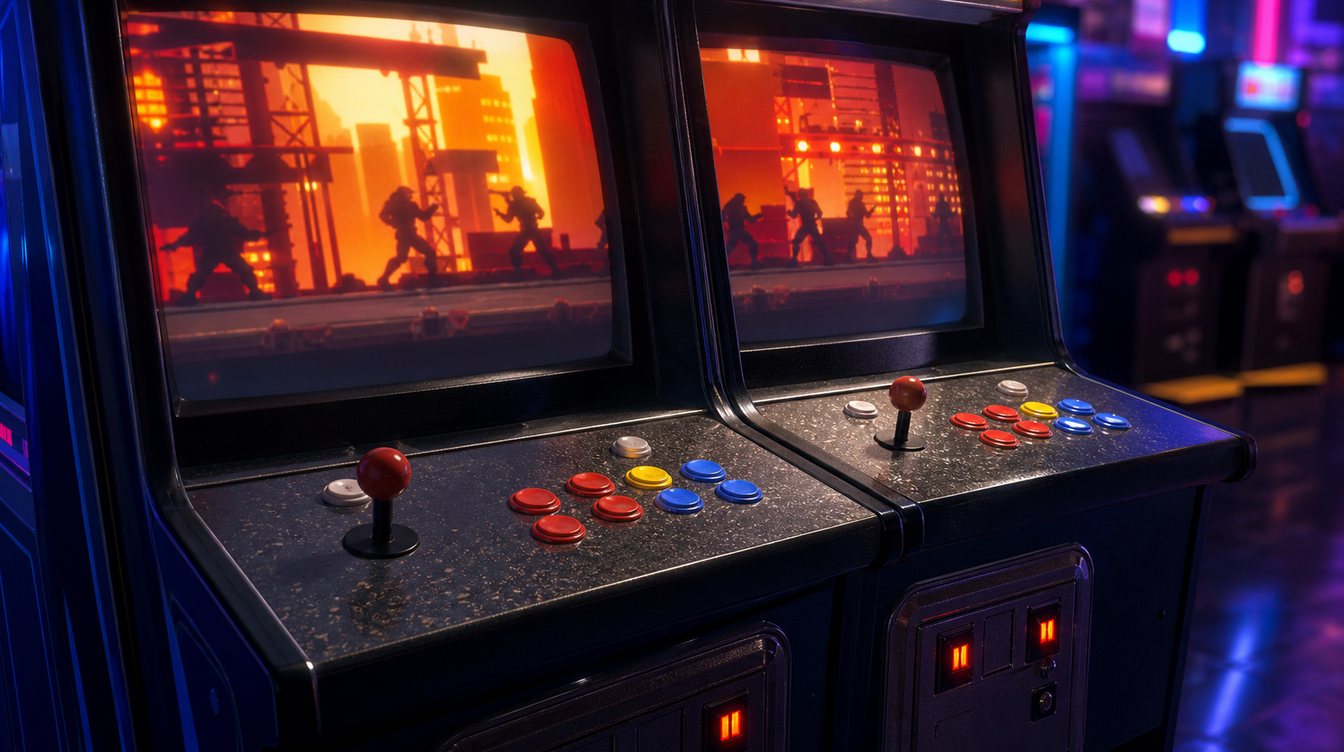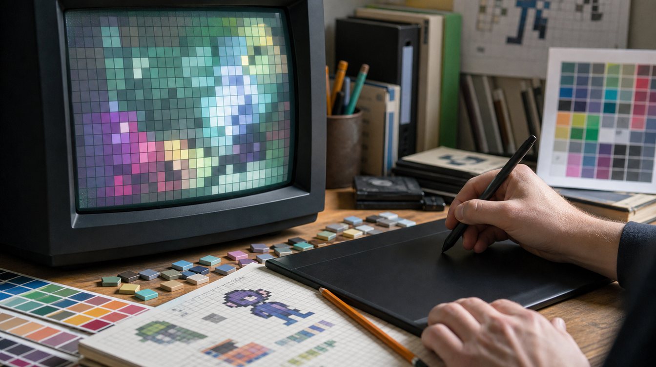
Pixel art games are sometimes treated as a style, but in the 90s they were also a technical negotiation. Artists worked with limited resolution, restricted palettes, memory budgets and display quirks. Strong visual design came from making every pixel carry weight.
Readability was the main rule. Players needed to understand characters, hazards, pickups and exits instantly. A sprite could be charming, but it also had to function. That practical discipline is why many old pixel art games still read clearly today.
Color limits encouraged identity. A small palette could make a world feel cohesive, while a single bright accent could guide the eye. Good pixel art often feels bold because it avoids visual noise.
Animation gave small sprites personality. A few frames could suggest weight, speed, fear, confidence or comedy. The best artists learned to imply motion rather than draw every detail.
For archives, screenshots are essential. Pixel art is best understood in context: tile size, interface placement, sprite scale and palette relationships. A cover image cannot replace the view players actually used.
VG90 covers pixel art as design history, not only decoration. The limits of old hardware created a visual language that modern games still borrow because it remains clear, efficient and expressive.